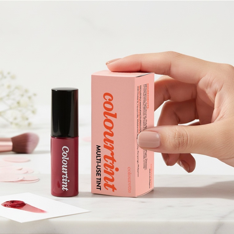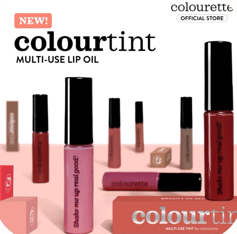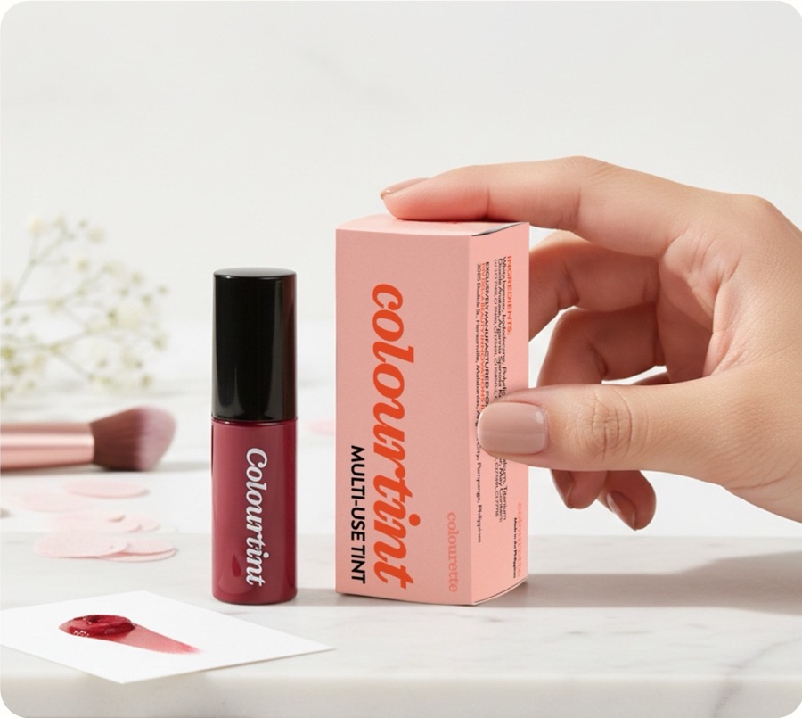

- The problemThe packaging no longer matched the aesthetic of the market the brand was speaking to, and the physical product and the digital presence felt like two different brands.
- The approachA monochromatic palette and a stronger type hierarchy, so the box reads as premium on a shelf and still holds up as a small product thumbnail.
- The outcomePackaging that mirrors the brand's shift toward high-performance, skin-centric beauty. A concept, so there are no sales numbers to report.